Launching Budgeting Tools for Muralists
Several years ago I painted some murals in Longmont Colorado. Determining how much paint to buy for a given design was difficult and often lead to buying too much or too little paint, both problems for the tight budget and timelines of mural projects. I realized I could make a tool to fix this problem for myself on future projects and give back to the Denver artists who had mentored me.
User research
I had conversations with several muralists and painters to determine essential features for the tool. From these conversations I determined several ground truths to inform the design.
- Paint is not procured from predictable pathways. Sometimes there will be leftover paint from previous projects, sometimes paint is donated, sometimes artist will buy mis-tints to keep costs down.
- Mock up designs usually do not include the exact paint colors used in the mural.
- Although subtractive color mixing algorithms exist, they still can’t estimate the ways in which more complex house paint pigments interact
Thus I needed to design as system that was flexible and resilent to the often less than ideal
Prototyping
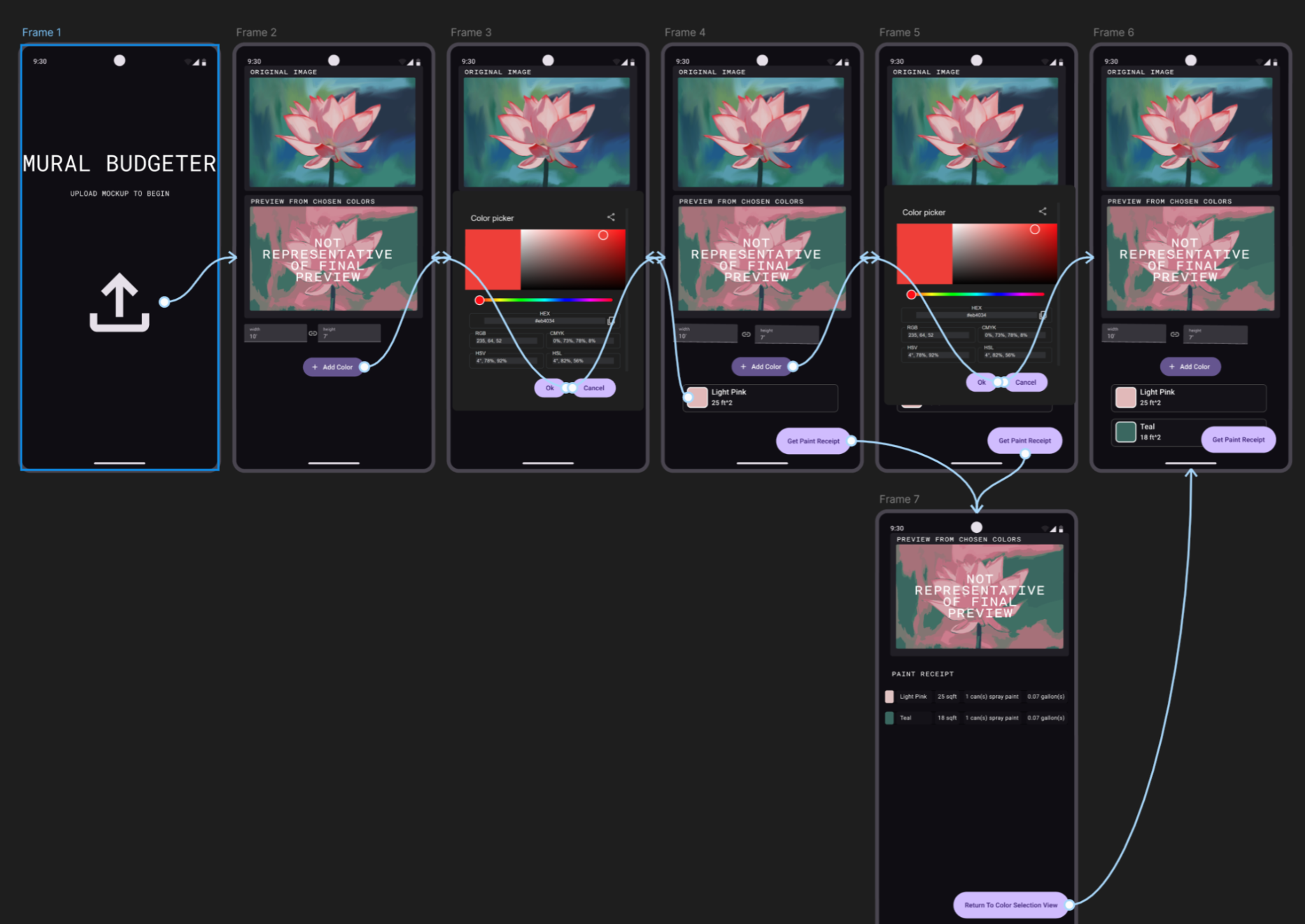
After sketching some wireframes I made several iterations of high fidelity prototypes. These were heavily revised as the project progressed.
Usability Studies


Acecssibilty
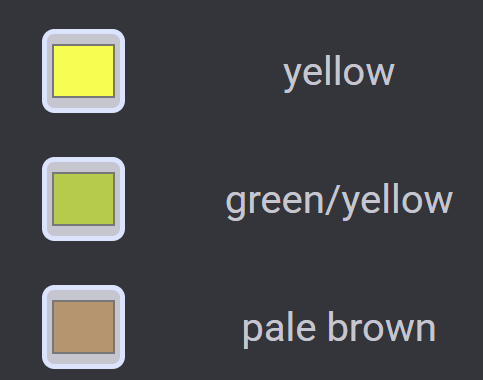
While I wrote the webapp with well formatted HTML to be compatible with screen readers, visual tools like these can be unavoidably inaccessible to non-sighted users. However, I realized there was a design opportunity to help colorblind users by labeling each color with a name. I used a color naming api with a large library of names to label each color chosen by the user. This helps colorblind users know how others will perceive the colors they are choosing.

Overall there was some confusion about "get paint required" and the idea of a paint receipt. While the language was less confusing than before, I might be able to add some additional context clues to inprove the understandibily to the design. The different desktop and mobile views also confused some because they thought I was making a mobile app. When presenting the mobile view in the future I should describe it as the "mobile/vertical view of the website." One good idea that was called to my attention was to add context popups that can help users make descisions. For example, yellow spray paint generally does not cover as well as other colors and that could be called to attention. This idea of providing help and context info reactive to user input throughout the design will help users understand the complexities of their task without being obtrusive or overwhelming.
Final Implementation
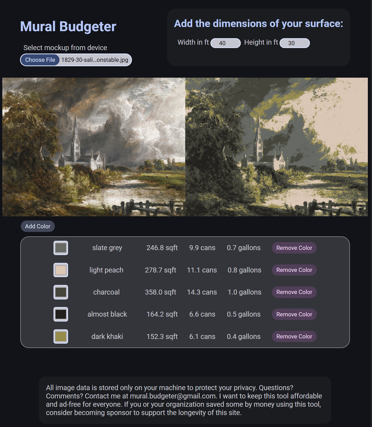
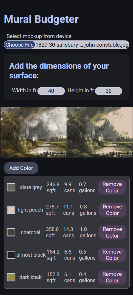
For the final implementation, I revised the column layout of the image and preview to a row layout to increase the available workspace on desktop while allowing the mobile view to fit the workspace and color pallet box on one screen. Check it out at muralbudgeter.com!

